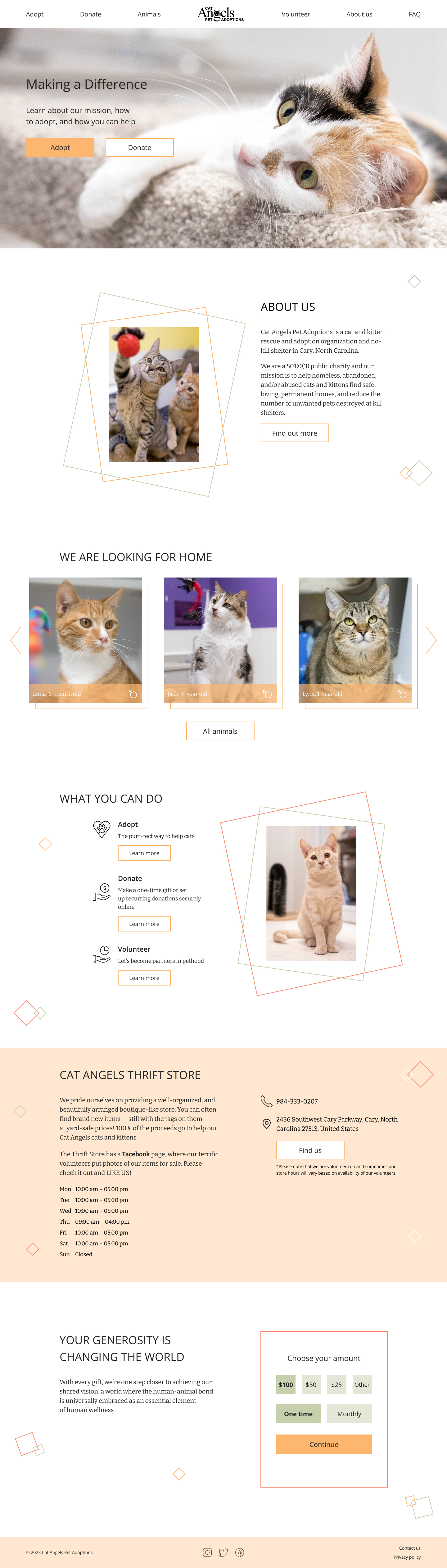
I had the pleasure of volunteering at Cat Angels Pet Adoption for an extended period of time. As a photographer, my main job was to create high-quality content for their website and social media accounts. Once I started studying UX/UI design, I felt an urge to improve their website.
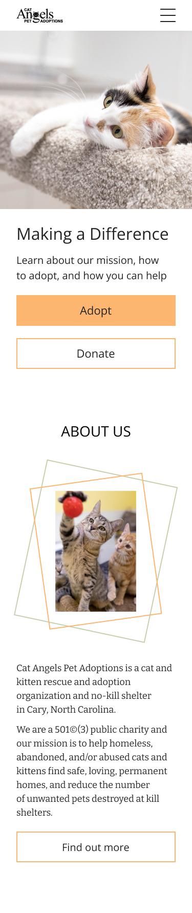
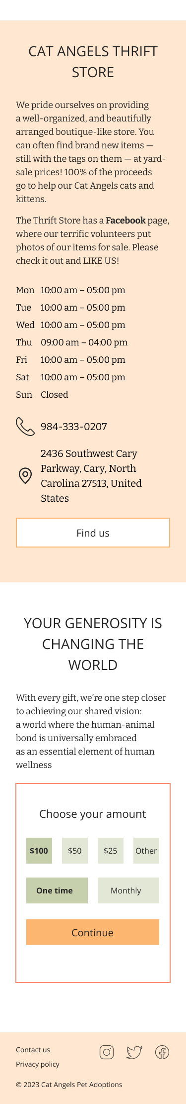
Unfortunately, as we all know, animal shelters usually lack resources, and allocating them towards website development, user research, and UX design is definitely not their top priority. A high-quality landing page, along with bright, beautiful photos, can showcase the cats available for adoption in an attractive and engaging way, which may encourage more people to adopt a cat. It can also help raise awareness of the existence of this particular cat shelter and its mission.
Creating a successful landing page for a cat shelter requires a careful balance of visual appeal, user-friendliness, and emotional content, while prioritizing the most important information and features for the audience. Here are some of the challenges that I had to face in the process of designing the landing page:
- Information architecture: organizing information on the landing page to be easily navigable and identifying the most important information and features.
- Emotional content: finding the right balance between compelling content and a user-friendly design, without overloading the page with emotional content that may turn potential visitors away.
- Limited attention span: creating a landing page that quickly captures user attention, with clear call-to-action buttons.
I have done my own research to gain a deep understanding of animal shelters audience and their needs, the potential problems that could lead to fewer adoptions and lower awareness of the shelter's mission.
I organized the content and structure of the landing page to ensure that the most important information and features were prioritized and easily accessible. Also I developed a content strategy that balances emotional content with a user-friendly design.
Using the research and information architecture as a guide, I sketched out different design ideas for the landing page, created low-fidelity wireframes to explore different layout options and iterated on the design. At the same time, I tried out different typographies and color palettes in order to determine what would be the most suitable for the project. Once I chose appropriate colors, typography, and imagery to create an emotionally resonant design, I started refining the wireframe into high-fidelity design along with a clickable prototype.